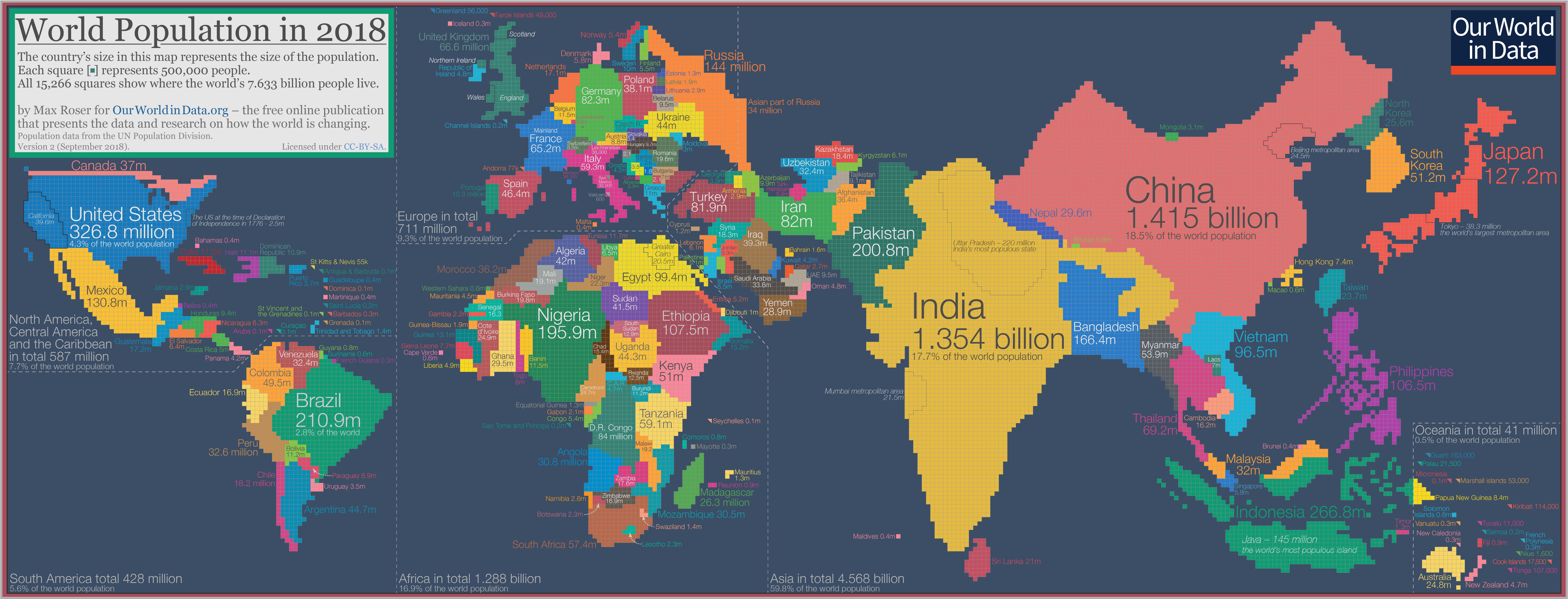
A short post today. I saw this visual yesterday - a cartogram of the world population from Our World in Data.

From the post:
While a geographical map is helpful if you want to find your way around the world, a population cartogram is the representation that we need if we want to know where our fellow humans are at home.
It’s a powerful visual that puts a lot into perspective. A very quick analysis of the top 15 most populous countries and how they rank in terms of nominal GDP (source).
| Country | Rank in Population | Rank in GDP |
|---|---|---|
| China | 1 | 2 |
| India | 2 | 7 |
| United States | 3 | 1 |
| Indonesia | 4 | 16 |
| Brazil | 5 | 9 |
| Pakistan | 6 | 41 |
| Nigeria | 7 | 31 |
| Bangladesh | 8 | 43 |
| Russia | 9 | 11 |
| Mexico | 10 | 15 |
| Japan | 11 | 3 |
| Ethiopia | 12 | (unranked) |
| Philippines | 13 | 39 |
| Vietnam | 14 | 49 |
| Egypt | 15 | 45 |